


How to Add a Sticky Navigation Bar in Showit
Published on
September 21, 2025
When you’re building a website in Showit, one of the best ways to make it user-friendly is by keeping the navigation bar visible as your visitors are scrolling. This is called a sticky navigation bar – and it’s especially useful on longer pages where you want people to easily access your menu at any point.
In this tutorial, I’ll show you how to create a sticky nav bar in Showit, walk you through all the canvas settings involved, and give you extra tips for mobile navigation. Let’s dive in.
Understanding Showit Navigation Basics
Navigation is a cornerstone of any website’s user experience, guiding visitors through different pages and helping them find the information they need. In Showit, you have the flexibility to create a navigation system that is both functional and stylish.
A mobile-style navigation can serve as either a primary or secondary navigation, offering a trendy and modern look. By using sticky settings and canvas settings, you can design your navigation to follow visitors as they scroll down the page, ensuring easy access at all times.
To enhance user experience, you can set the navigation icon to be an X icon, which users can click to close the navigation. This is achieved by setting the click action to hide the canvas. The navigation can be tailored to be visible on both desktop and mobile devices, using mobile settings and canvas settings to control its appearance.
Showit allows you to use multiple canvases on each page, providing a flexible and customizable navigation system. Ensuring the correct stacking order is crucial so that the navigation canvas remains on top of other canvases, keeping it clear and visible.
By setting the sticky options to stick to the top of the page, your navigation will follow visitors as they scroll, enhancing usability. Canvas settings can be used to customize various aspects of the navigation canvas, including its background, height, and width. Click actions are essential for defining the behavior of the navigation canvas, such as showing and hiding the canvas.
What Is a Sticky Navigation Bar in Showit?
A sticky nav bar is a navigation menu that stays visible at the top of your site as users scroll down the page. In Showit, this is handled at the canvas level – meaning you set a canvas (which holds your navigation) to “stick” in place.
If you’re using a site canvas for your menu (which I highly recommend), you can apply sticky settings across multiple pages without duplicating the canvas everywhere. Ensure that the navigation canvas has a higher stacking order than any other canvas to prevent it from being obscured.
Set Up Your Navigation Bar
First, make sure your nav bar is built inside its own canvas – ideally, a site canvas so you can reuse it across all your pages.
It’s crucial to ensure that your navigation bar remains visible while scrolling to enhance user experience. This can be achieved by creating a sticky header or using a mobile-style navigation that follows the user as they scroll, ensuring easy access to links without needing to scroll back up.
Add the key elements:
A logo or site name (typically in a box or image element)
Navigation links (text boxes or icons with click actions)
A menu icon (hamburger icon) for mobile
An x icon to close the menu
A background shape or colored box that will help the menu stand out
You can create a mobile version by duplicating the nav canvas and toggling visibility using canvas display settings or screen size-based visibility. It is also important to ensure that navigation elements are easily accessible while scrolling.
Customizing Navigation Links and Menus
Customizing your navigation links and menus is key to creating a clear and user-friendly navigation system. In Showit, the add action feature in the click action tab allows you to choose additional click options for your navigation links and menus.
To display the mobile nav canvas, set the added click action to Show Canvas > Mobile Nav (or the name of your mobile nav canvas). Add a hamburger menu icon and place it, then use the click action tab to customize its behavior.
For mobile nav menu options, apply the correct add action, such as setting the click action to Hide Site Canvas > This Site Canvas to close the mobile nav. Each menu item should be linked to its corresponding location using the click action tab.
The X icon should be set with the action Hide Site Canvas > This Site Canvas to close the mobile nav canvas. Proper click actions are essential for mobile nav menu links to function correctly, providing a smooth and seamless user experience.
Customize your navigation bar to fit your website’s specific design using canvas settings and sticky settings. This ensures that your navigation is not only functional but also visually appealing, enhancing the overall user experience.
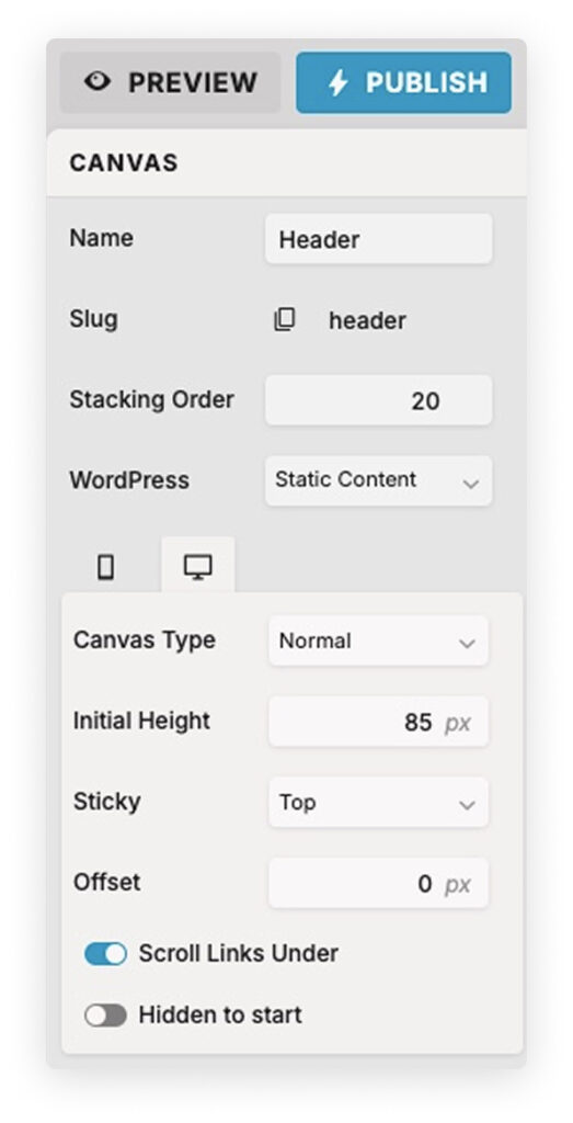
How to Make the Canvas Sticky
Once your navigation canvas is ready:
- Select the navigation canvas in the left-side panel.
- In the right-hand settings, find the Sticky toggle.
- Turn it ON.
You can also adjust the offset – this controls how many pixels from the top of the screen the canvas will stick. Most people leave it at 0, but if you want a little breathing room, you can increase it slightly. Making the canvas sticky ensures that the navigation bar remains visible while scrolling.
Important:
Make sure your sticky canvas has a higher stacking order than the canvases below it. Otherwise, it might get hidden behind other content. You’ll find this under Canvas Settings > Stacking Order. Ensuring a higher stacking order than any other canvas is crucial to prevent the navigation bar from being obscured.
Setting Up Sticky Mobile Navigation
Mobile navigation works a little differently, especially if you’re using a collapsible menu.
Here’s how to do it:
- Create a separate mobile menu canvas that appears on click (usually triggered by a hamburger icon).
- Add a Click Action to your menu icon that says: Show Canvas > [Name of your mobile menu].
- On your mobile menu canvas, include an x icon with a click action to Hide Canvas.
To keep your mobile menu visible and tidy:
- Check that the canvas is set to sticky if needed
- Use hidden elements wisely so only mobile users see it
- Make sure everything is easy to tap and navigate with fingers
Ensuring that the mobile navigation remains visible while scrolling enhances user experience by providing easy access to links without needing to scroll back up.
Troubleshooting Sticky Nav Issues
If your sticky nav isn’t working the way you expect, here are a few things to check:
- Is your nav canvas a site canvas?
- Did you forget to enable sticky in the canvas settings?
- Is it getting hidden by another canvas with a higher stacking order?
- Are your click actions properly set up for mobile open/close?
- Is the canvas visible on all device sizes?
- Ensure that the navigation canvas has a higher stacking order than any other canvas to prevent it from being obscured.
- Make sure the navigation bar remains visible while scrolling to enhance user experience.
Test on both desktop and mobile and use the Preview function often!
Design Tips for a Great Sticky Nav
- Keep the nav bar compact and non-distracting.
- Use a contrasting background so it’s always legible over your content.
- Don’t overload it – especially on mobile. Stick to essentials like Home, About, and Contact.
- Use padding and spacing for a clean look.
- Double-check how it works on other canvases like landing pages or one-pagers.
- Ensure the navigation canvas has a higher stacking order than any other canvas to prevent it from being obscured by other elements on the site.
Make sure the navigation bar remains visible while scrolling to enhance user experience and provide easy access to links.
Final Notes
Adding a sticky navigation bar in Showit is one of those small tweaks that can make a huge difference in usability. It keeps your key links accessible, helps guide visitors, and makes your site feel more polished.
Try it on your homepage first, test it out, and then add it to other pages as needed. With a bit of setup, you’ll have a smooth, user-friendly experience that works across both desktop and mobile.
Ensuring that the navigation bar remains visible while scrolling enhances user experience by providing easy access to links without needing to scroll back up.
FAQ
Can I make more than one canvas sticky?
Technically yes, but be careful – it can cause stacking and visibility issues.
Will sticky nav work on all screen sizes?
Yes, but you may need to customize how it behaves on mobile.
Can I hide the sticky nav on certain pages?
Yes! Use the “Canvas Display” setting and uncheck the canvas for specific pages.
Why is it important to ensure the navigation bar remains visible while scrolling?
Ensuring the navigation bar remains visible while scrolling enhances user experience by providing easy access to links without needing to scroll back up. This can be achieved by creating a sticky header or using a mobile-style navigation that follows the user as they scroll.
Have questions or want to see this in action? Drop a comment below or check out the other Showit tutorials in the blog. Hope this was helpful!
You’ve GOT what it takes
Download 30 marketing ideas on how to promote your website

