


How to Make a Showit Website Mobile-Friendly
Published on
September 10, 2025
Creating a Showit website offers unmatched creative freedom, but with that freedom comes responsibility – especially when it comes to designing for mobile. In today’s digital landscape, mobile devices account for more than half of all web traffic. That means your Showit site needs to look good not just on a desktop, but in the palm of someone’s hand.
One of the key advantages of Showit is the ability to customize mobile and desktop designs independently, giving you greater control over the user experience on different devices.
In this article, we’ll walk through how to make your Showit website mobile-friendly, from using canvas settings correctly to fine-tuning your mobile navigation. Whether you’re starting from scratch or working with a template, these tips will help you create a beautiful, functional experience for mobile users.
Understand Showit’s Dual Design Interface
One of Showit’s superpowers is the ability to design your desktop and mobile versions independently. This gives you total control over how your website looks on every screen – but it also means you have to pay attention to both the desktop site and the mobile site.
When you’re designing inside Showit, you’ll notice two separate workspaces: one for desktop view, one for mobile view. Each canvas and element can be resized, rearranged, or even hidden depending on the version.
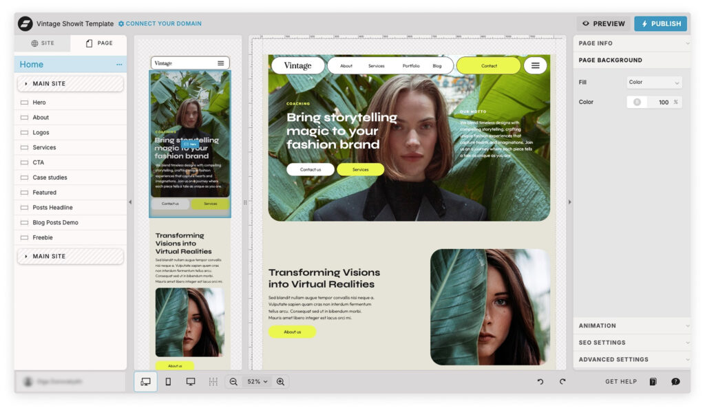
It is important to distinguish between mobile and desktop versions when designing websites. Use the side-by-side view to see how changes affect both layouts at once. It’s a helpful way to catch inconsistencies early and avoid design surprises.
Start with Mobile in Mind
Even though it’s tempting to focus on the desktop version first (because it’s bigger and easier to work on), designing with mobile in mind from the beginning will save you time and headaches later.
Here’s why:
- Mobile users scroll vertically – fast.
- Text needs to be large enough to read without zooming.
- Buttons and menus should be easy to tap with a thumb.
As you build out each section, switch to mobile view and ask yourself: Does this make sense on a small screen? Is there enough space between elements? Are images and text easy to scan?
Adjusting Canvas Settings for Mobile
Showit gives you the ability to hide elements on mobile or desktop – this is huge. Sometimes an animation, large graphic, or extra feature might look amazing on a desktop but feel cluttered or overwhelming on mobile.
You can:
- Use the canvas settings to disable a section on mobile only.
- Duplicate a canvas and create a mobile-specific version with a cleaner layout, larger fonts, or a simplified design.
- Keep content stacked vertically and centered for better flow.
Always check your entire page in mobile view to make sure hidden elements aren’t breaking your layout.
Optimizing Text Boxes and Images
Text and image scaling is one of the trickiest parts of mobile design. A few pointers:
- Text boxes: Resize for readability. What looks fine on a desktop may feel cramped on mobile.
- Font sizes: Start at 16px+ for body text on mobile. Go bigger for headlines.
- Spacing: Add breathing room between text and other elements to prevent clutter.
- Images: Avoid overly wide or complex images that don’t scale well. Use square or vertical crops where possible.
You might need to duplicate and customize certain elements just for mobile. That’s okay – it’s part of the beauty of Showit.
Designing Mobile Navigation
Your mobile nav is one of the most important elements of your site, especially for users on a mobile device. If users can’t figure out how to move around, they’ll bounce.
Here’s how to create a solid mobile navigation:
- Use a hamburger menu with a clear icon (like the x icon to close).
- Make sure click actions work correctly and that menus are easy to tap.
- Avoid tiny links – opt for large buttons or stacked menus.
- Keep it consistent across your site canvases.
Consider customizing your mobile menu design to match your brand while staying simple and intuitive.
Breakpoints and Responsiveness in Showit
Unlike platforms like Webflow or WordPress themes, Showit doesn’t use automatic breakpoints. Instead, it allows full manual control over how each version of your site behaves.
This means:
- You must fine-tune your layout manually in the mobile settings and desktop settings.
- There’s no automatic scaling – what you see is what you get.
- You need to double-check everything in both views before publishing.
The upside? You’re never stuck with clunky layouts or mismatched styles. You can design for function and style, precisely.
Mobile SEO and Load Times
Mobile SEO and load times are crucial aspects of mobile-responsive design in Showit. To ensure your site is optimized for mobile search engines, follow these best practices:
- Optimize Mobile-Specific Keywords: Use keywords that are relevant to your content and target audience on mobile devices. Think about what your users might search for on their phones and incorporate those terms naturally into your content.
- Use Proper Tag Usage: Ensure that all meta tags, titles, and descriptions are optimized for mobile devices. This helps search engines understand your content and improves your site’s visibility in mobile search results.
- Regularly Check Load Times: Use tools like Google PageSpeed Insights to check your site’s load time on mobile devices. A fast-loading site enhances user experience and can positively impact your search rankings.
- Optimize Images: Compress images to reduce file sizes and improve load times. Large images can slow down your mobile site, so use tools like TinyPNG or ImageOptim to keep your images lightweight without sacrificing quality.
- Minimize Use of Heavy Scripts: Prioritize essential functionalities and minimize the use of heavy scripts that can slow down your mobile site. Streamlining your code can significantly improve load times and overall performance.
By following these best practices, you can improve your site’s mobile SEO and load times, providing a better user experience for your visitors.
Common Pitfalls to Avoid
When working on your Showit mobile site, avoid these common mistakes:
- Ignoring the mobile version until the very end.
- Leaving hidden elements floating in the stacking order, which can break the layout.
- Forgetting to test the menu and all click actions on real devices.
- Using desktop-sized images that slow down your mobile site speed.
- Overcomplicating your mobile layout – keep it clean and direct.
Troubleshooting Common Mobile Design Issues
When designing a mobile-responsive site in Showit, you may encounter common issues that can affect the user experience. Here are some troubleshooting tips to help you resolve these issues:
- Elements Not Displaying Correctly: Check the canvas settings and ensure that the elements are set to display correctly on mobile devices. Sometimes, elements may be hidden or misaligned, so double-check your settings.
- Mobile Navigation Not Working: Check the mobile nav settings and ensure that the navigation is set to display correctly on mobile devices. Make sure your hamburger menu and click actions are functioning as intended.
- Images Not Loading: Check the image settings and ensure that the images are optimized for mobile devices. Large or improperly formatted images can cause loading issues, so ensure they are compressed and correctly sized.
- Site Not Loading Quickly: Check the load times and ensure that the site is optimized for mobile devices. Use tools like Google PageSpeed Insights to identify and fix any performance issues.
- Desktop Design Not Translating to Mobile: Check the desktop design settings and ensure that the design is optimized for mobile devices. Sometimes, elements that look great on desktop may need adjustments for mobile. Use Showit’s dual design interface to make necessary tweaks.
By following these troubleshooting tips, you can resolve common mobile design issues and provide a better user experience for your visitors.
Examples and Use Cases
Let’s say you’re a designer creating a site for a wedding photographer. On desktop, you might include a full-width gallery and floating text overlays. On mobile, those should become stacked images with simpler captions for quicker loading and easier viewing.
Using site canvas features, you can create a streamlined experience that works beautifully on both devices while maintaining your brand’s visual integrity.
Maintaining a Mobile-Friendly Showit Site
Maintaining a mobile-friendly Showit site requires regular updates and checks to ensure that the site remains optimized for mobile devices. Here are some tips to help you maintain a mobile-friendly site:
- Regularly Check Mobile Settings: Check the mobile settings and ensure that they are optimized for mobile devices. Regularly review your mobile layout to catch any issues early.
- Update Images and Content: Regularly update images and content to ensure that they are optimized for mobile devices. Fresh, optimized content keeps your site engaging and efficient.
- Check Load Times: Regularly check load times and ensure that the site is optimized for mobile devices. Use tools like Google PageSpeed Insights to monitor performance and make necessary adjustments.
- Test on Different Devices: Test the site on different devices to ensure that it is optimized for mobile devices. Different phones and screen sizes can reveal issues you might not catch otherwise.
- Keep Showit Software Up-to-Date: Keep the Showit software up-to-date to ensure that you have the latest features and updates. Regular updates can improve performance and security.
By following these tips, you can maintain a mobile-friendly Showit site that provides a great user experience for your visitors.
Final Tips and Best Practices
Think of mobile as its own design project.
- Use Showit’s creative freedom to your advantage, but prioritize clarity, speed, and accessibility.
- Run tests on different phones and screen sizes.
- Always preview the entire page and test your menu, buttons, and links.
Designing a mobile-friendly Showit website takes a bit of extra attention, but the payoff is huge. A smooth, optimized mobile experience helps your visitors engage with your content, find what they need, and take action – whether that’s booking your services or making a purchase.
Your mobile site doesn’t have to be a carbon copy of your desktop design – and it probably shouldn’t be. With Showit’s tools and your design instincts, you can build something that functions flawlessly and reflects your brand beautifully.
Need help customizing your Showit template for mobile? Check out our Showit template collection or reach out for a 1:1 site audit – we’d love to help!
Frequently Asked Questions about Making a Showit Website Mobile-Friendly
Q: Does Showit automatically make my site mobile responsive?
A: Not exactly. Unlike other platforms that use automatic breakpoints, Showit gives you full control over both the desktop and mobile versions of your site. That means you need to manually design and fine-tune your mobile layout to ensure it’s user-friendly.
Q: Can I hide certain elements on mobile only?
A: Yes! Showit allows you to hide elements or entire canvases on either desktop or mobile. This is perfect for simplifying your mobile site and improving load time and readability.
Q: What’s the best font size for mobile in Showit?
A: For mobile, start with a minimum of 16px for body text and go larger for headings. Always test your site on an actual phone to make sure text is readable without zooming.
Q: How do I set up a mobile-friendly navigation menu in Showit?
A: Use a hamburger menu (three-line icon) in your site canvas and set up click actions to show or hide your mobile menu. Make sure the x icon or close button is easy to tap and that links are large enough for finger taps.
Q: Can I design a completely different layout for mobile?
A: Yes! You can customize the mobile layout independently from desktop. You can rearrange, resize, or even duplicate elements to suit the mobile user experience. Just make sure the content remains consistent across both versions.
Q: How can I check if my Showit site looks good on mobile?
A: Use the mobile view toggle inside the Showit editor. For best results, also preview your site on multiple physical devices and screen sizes (like an iPhone and an Android). Test all menus, buttons, and scroll actions.
Q: Are Showit templates already optimized for mobile?
A: Most high-quality Showit templates are designed with mobile in mind, but you’ll still want to customize your mobile layout – especially after adding your own content, images, and brand elements.
You’ve GOT what it takes
Download 30 marketing ideas on how to promote your website

