Ready for a new website? We create strategic, marketing-focused Showit and Squarespace templates for creative entrepreneurs.
Need help with custom design? Reach out to team@madebyapplet.com.
A web designer with vast experience in marketing and copywriting, course creator and Showit specialist
Hi, I'm Olga
Browse Showit Templates
VIEW ALL TEMPLATES
Three Web Design Trends That Never Go Out of Style
Published on
April 2, 2024
Meet three classic designs!
The question we get asked all the time is: How often do you have to redesign your website? We usually say that you are looking at 2-3 years. Every couple of years, you have to if not redesign completely, but facelift your website.
If you’re worried that your new website design will become quickly outdated, here’s a suggestion from us: Pick one of the three traditional designs that are proven to last – Minimalism, Swiss Style, or Editorial Style.
They are similar, very similar, but somewhat different. Each of these designs brings something unique to the table, yet they all share a commitment to clarity, usability, and timelessness.
What exactly makes these styles timeless classics in the world of web design? And how can you, our fellow business owner, use them to elevate your brand’s website?
Swiss Style in Web Design: Innovative
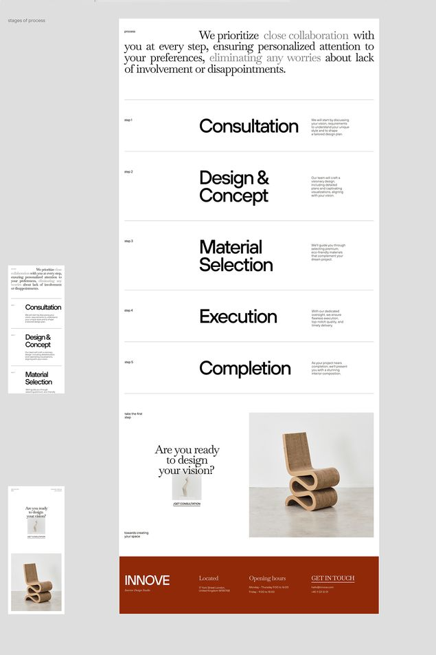
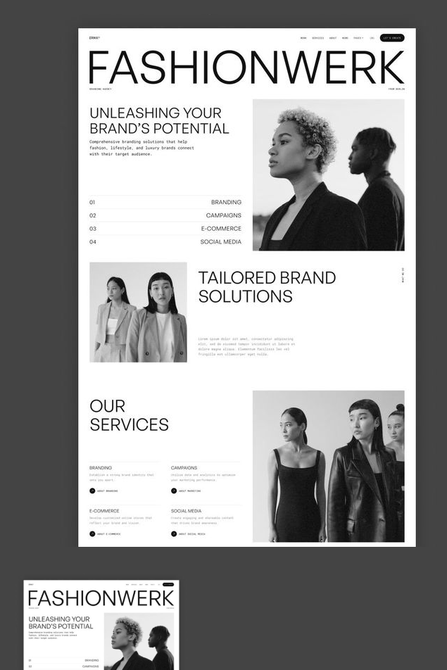
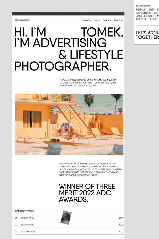
Swiss Style, also known as International Typographic Style, is a design movement that originated in Switzerland in the 1950s and 1960s. In this style, every detail serves a purpose. Swiss web designs utilize a grid system to organize content, ensuring alignment and coherence across the layout. This results in a clean, ordered appearance that facilitates navigation and readability. The focus is on the utility, not beauty.
Swiss Style’s usability focus makes it an excellent choice for businesses that prioritize information delivery and functionality, such as educational platforms or SaaS companies.
If you want to use the Swiss style for your business, consider this:
- Keeping things concise is key. The whole site sticks to just one typeface, and to make things stand out, it’s all about playing with the size of the text and the space around it.
- Use san-serif fonts only!
- The design is rational, with every element serving a clear purpose, making the content accessible and easy to navigate. Use color sparingly, only when it is needed to serve a clear purpose!
Minimalism in Web Design: Timeless
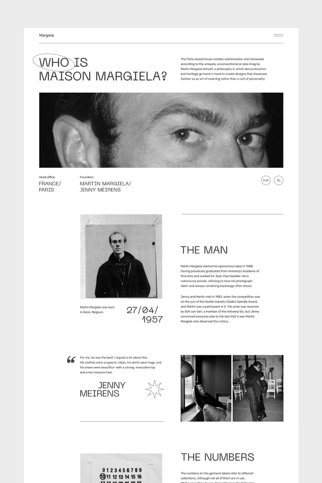
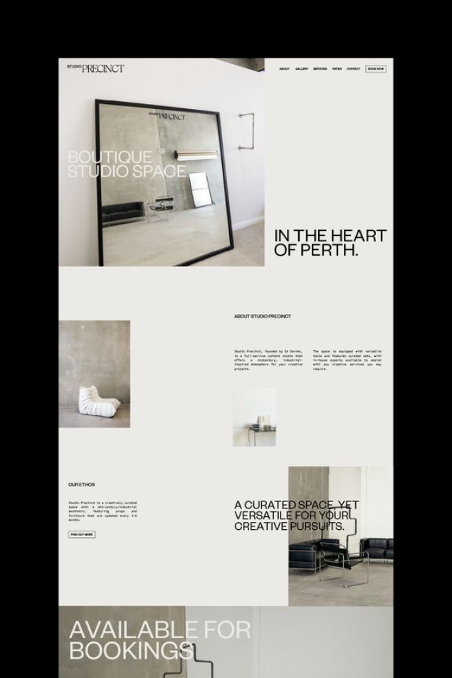
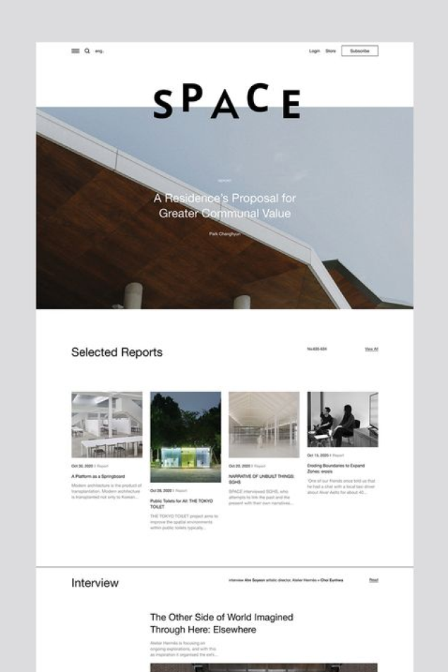
Content is king – that’s the Minimalism Motto. Minimalism emphasizes a “less is more” approach, stripping away non-essential elements to focus on what’s important. This simplicity makes websites easier to navigate and understand, enhancing user experience.
Minimalism as a concept has its roots in various art and design movements of the 20th century, including the Bauhaus movement in Germany.
Websites with minimalist designs tend to load faster and perform better due to fewer elements and reduced complexity. This efficiency can lead to better search engine rankings and user satisfaction.
In your business’s goal is to focus on messaging and content, than certainly pick the minimalist design.
Consider this:
- Compared to Swiss style, Minimalism uses a softer grid.
- Two or more typefaces are allowed as the emphasis is on readability and presentation of content. In minimalism, typography is not just a means of displaying text but also an essential design element. Careful selection of fonts and font sizes can create visual interest and hierarchy without adding extra elements.
- Minimalism is a true classic as it avoids design trends that can quickly become outdated.
Editorial Style in Web Design: Chic
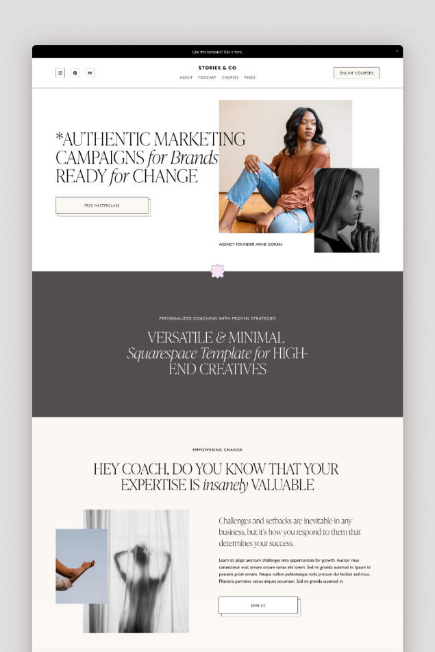
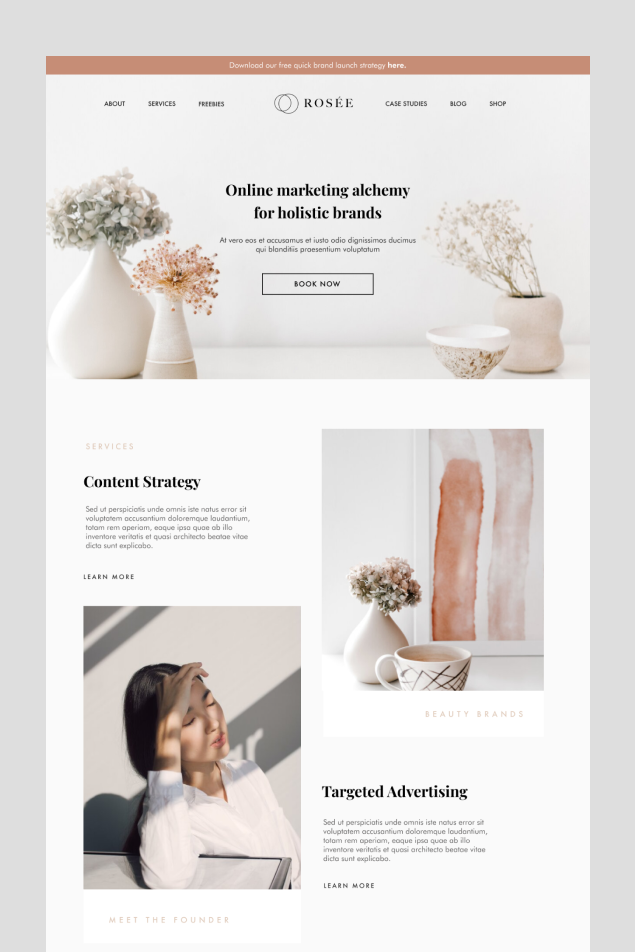
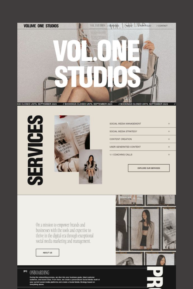
Editorial style is the least minimalist of the three as it allows rich visuals and branding to convey the message. Inspired by print layouts and glossy magazines, Editorial style emphasizes storytelling, content hierarchy, and a structured presentation of information.
It creates a narrative-driven experience that guides the user through content with structured elegance.
Choose Editorial style for your business if you want to create a compelling narrative around your brand, engage your audience with rich, immersive content, and structure your information in a way that tells a story. It’s ideal for content-heavy sites like blogs, online magazines, or any platform where storytelling and detailed content presentation can enhance the user experience and deepen the connection with your audience.
Consider this:
- Modularity, spacing and visual hierarchy is essential in Editorial style.
- The use of more then two typefaces is allowed to create strong type hierarchy.
- With its use of high-quality imagery and varied typography, Editorial Style can create a visually striking experience, making it ideal for businesses in creative industries like fashion, design, and photography.
Design trends change every couple of years. As a web designer who’s been in the industry since 2014 (that’s when I built my first website for a client!), I can say that I can easily spot trends and tell which year the website is from. But it’s different with these three styles – Swiss, Minimalism and Editorial. They will truly last you for 3-5 years easily, and you won’t have to drastically change the website. As technology changes, these styles can be easily adjusted for new platforms and tools.